Difference between revisions of "Tables (Excel)"
(→Extract data) |
|||
| Line 28: | Line 28: | ||
[[File:TAPT_14.png|border]] | [[File:TAPT_14.png|border]] | ||
| + | |||
==Format the data as a table== | ==Format the data as a table== | ||
Revision as of 15:58, 8 December 2014
The reporting features of Charitylog are designed to allow users to extract data from their systems in Microsoft Excel format. Excel is industry standard software, and will allow you to do sorting of data, and create charts etc.
One of the most common questions we are asked in the support department is how to create a pivot table. This guide shows you how.
Contents
What is a pivot table?
A pivot table is a way of displaying information from a large set of data. Pivot tables are one of Excel's most powerful features, and they are surprisingly easy. With only a few steps, you can easily analyse Charitylog spreadsheet outputs using pivot tables.
Pivot tables allow you to count things, and display a count of one thing against something else. For example, if you have a data set which shows a list of people along with their age range and ethnic background, you could;
- Count how many people there are in each age band
- Count how many people there are in each ethnic group
- Compare the two, and see the ethnic group breakdown of each age band - and/or the age band breakdown of each ethnic group.
Extract data
First you will need to extract data from the system in Excel format. Information is most commonly exported from Data Extractions, the KPI Report Designer, or a mix of the two.
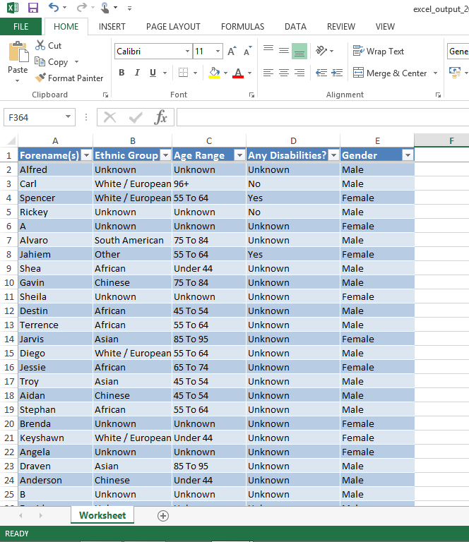
Once you have your spreadsheet open on your computer, you can begin work. Note that Excel is careful about allowing you to open files downloaded from the internet, so it's possible you may need to click the "Enable Editing" button on the spreadsheet when it opens, as shown here:
Format the data as a table
To create a pivot table, it's helpful to first put your data into a (non-pivot) table. This guide uses Excel 2013 for screenshots, but other versions of Excel are very similar.
Define the data range for the table
You'll need to let Excel know which data you want to go into a table. For any spreadsheet exported from Charitylog, this is likely to be all of the data on the sheet.
- include column headings
- exclude any titles or descriptive text above the column headings
There are many ways to select cells on a spreadsheet but the simplest way is to do it manually.
Select the last cell in the data
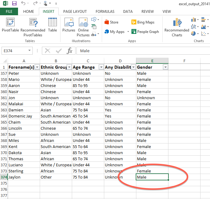
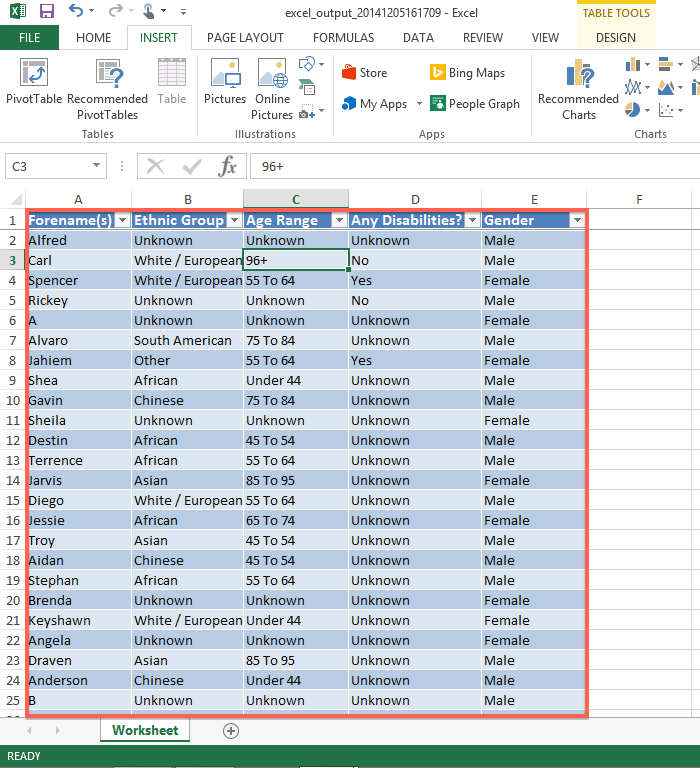
Scroll to the very bottom of the data, and as far right as the data goes. Remember that occasionally there might be a blank in the last cell (this is why it's good to start off by finding the end of the data first). Click on the cell so that it's highlighted.
Select the first cell in the data
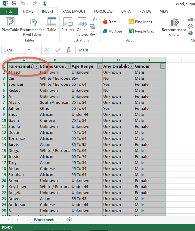
Now, without clicking any other cells in between, scroll to the top left of the spreadsheet. Hold the shift key and click in the first cell that you want to include. Remember that you need to include the column headers, but exclude any other text above them. Your data, and its column headers, should now be highlighted.
Insert the table
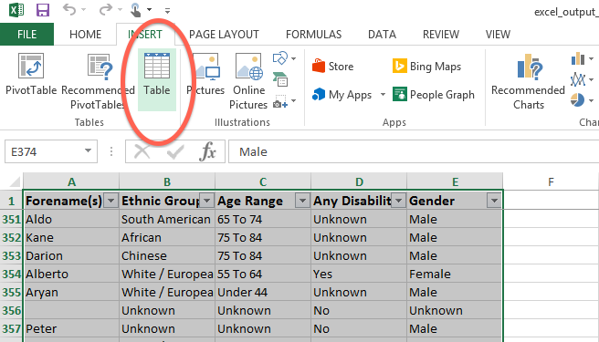
At the top of the screen, on the "INSERT" tab, click "Table".
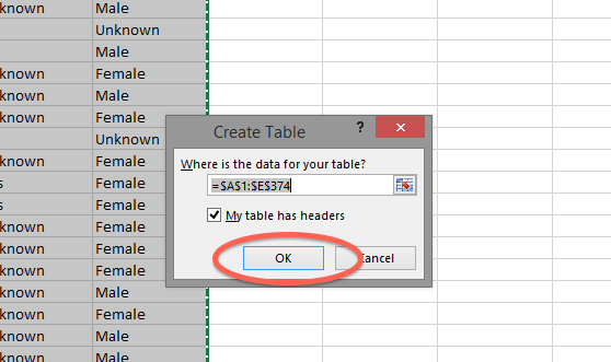
A box will now appear to enter the table data range, but because you have already selected the data before clicking the button, you don't need to make any alterations. You just need to make sure that "My table has headers" is ticked - this is so that Excel knows that the top line you've selected is column headings rather than actual data. Click "OK".
The data will now be formatted as a table.
Convert the table to a pivot table
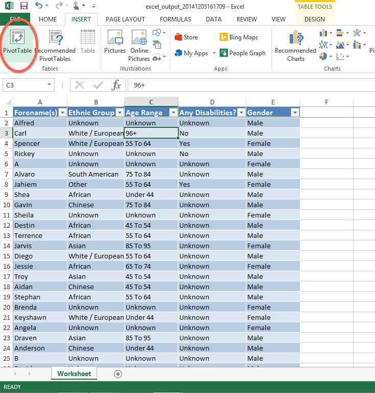
Once the data is properly formatted as a table, it can be easily converted to a pivot table. Click anywhere in the table...
...then click the "Pivot Table" button on the "INSERT" tab.
Pivot table data range
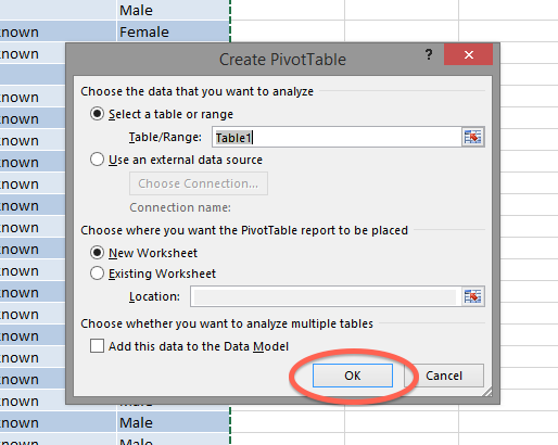
Another dialog box will now appear, prompting you to enter the pivot table data range. Because the data has already been formatted as a table, you shouldn't need to change anything; the data range will be set to that of your previously created table, and the pivot table will be placed in a new worksheet. Click "OK".
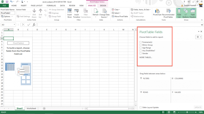
You will now be taken to the pivot table. It will be blank, but your column headings should be displaying at the right hand side of the screen.
Counting things with a Pivot Table
The first and simplest function of a pivot table is to count items. The spreadsheet used for the screenshots is a data extraction of clients, showing their name, ethnic group, age range, whether or not they have any disabilities, and their gender. This means that the columns in the spreadsheet have been created from information entered using drop-down lists. You can use the pivot table to count how many times each option appears - for example, what the ethnic group breakdown of the client base is.
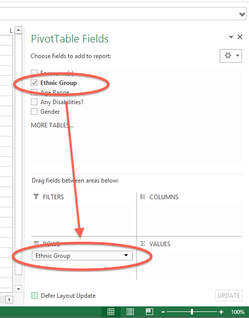
To do this, first drag the "Ethnic Group" heading from the "PivotTable Fields" area to the "ROWS" area, as shown.
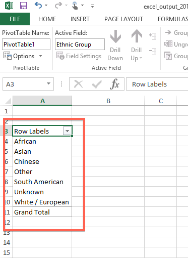
You should see the pivot table itself (on the left of the screen) update, creating row labels for every entry in the data you have dragged.
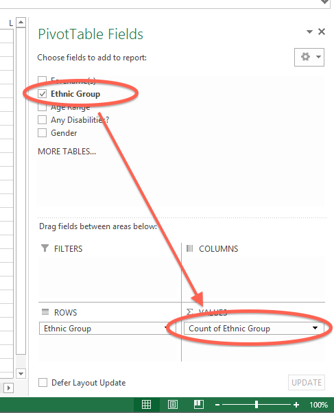
Now, drag the "Ethnic Group" heading from the "PivotTable Fields" area to the "VALUES" area as well. (You need to drag the top one from the fields area, not drag the previous one out of the rows area and into the values.)
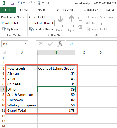
Again, the pivot table itself will update. This time it displays a count of how many times each option appears in the original data. So, with just a few clicks, you have displayed the ethnic background breakdown of a whole range of people.
Why is the count useful?
Hopefully you can already see the usefulness of this method of looking at the data, but there are two particularly useful things to note here;
- Counting entries in this way can be done on the output of any KPI. For example, you could run a Clients Accessing report to see which clients have accessed a certain project over a year, then use this method to see their ethnic group profile, age ranges, genders etc (providing that data has been entered to the system, of course).
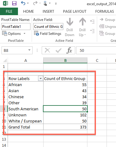
- A count like this lets you easily see where there might be holes in the data. For example, in the screenshots above, there are 102 "Unknowns" out of 373 total entries. Looking at what this actually means about the data on the system, it means that 27% of clients are listed on the system with no Ethnic Group entered on their record, which is less than ideal for reporting.
What to do about missing data
A "hole" in the data like this usually prompts you to look at the processes which are being used to enter the data in the first place. One way or another, the data is not being entered; what can be done about it? Possible options include:
- Amending the Input Field Rules, either for the whole system or for Projects, so that users are prompted to obtain the data
- Look at the available options. There is no "client preferred not to say" option. Including this option in the source drop-down list will give users a way to properly record the fact that the client did not wish to disclose the information (as is their right)
- It may simply be a training issue - perhaps staff just need to be reminded that collecting this information is important
Creating a chart from the count
Once you have created a count/summary like this, the pivot table format makes it very easy to create a chart. Click somewhere in the table:
Then , from the "PIVOTTABLE TOOLS > ANALYZE" tab, select "PivotChart".
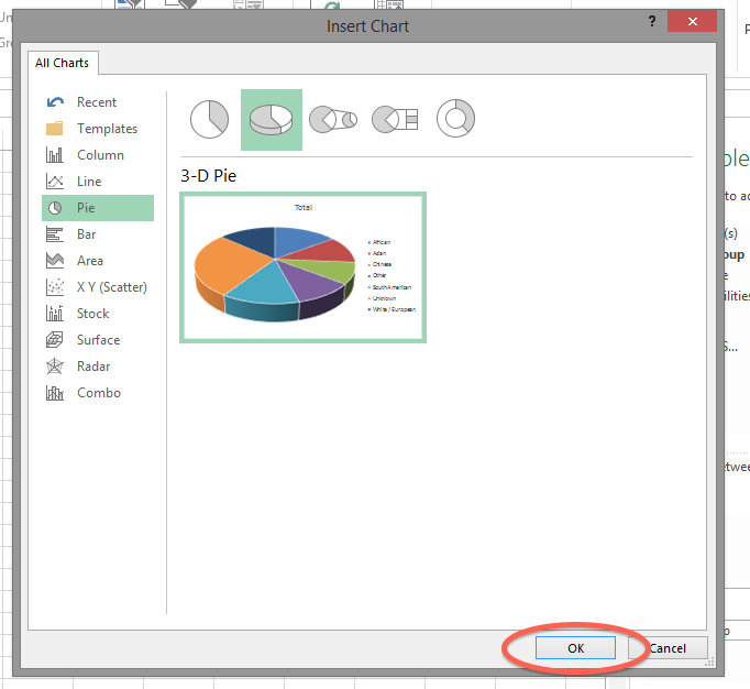
A window will now appear where you can choose the type of chart you would like to use. Select the type you want and then click OK.
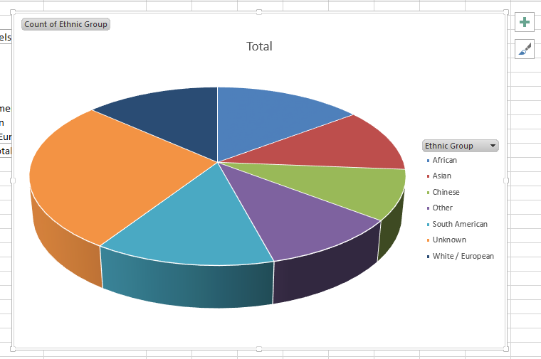
The chart will appear in the worksheet. From here, you can edit the chart title/legend etc, and also copy the chart object out into other Microsoft Office applications to include it in reports etc.
Comparing counts using a Pivot Table
Having seen how you can use a Pivot Table to count a range of data, the next step is to use the Pivot Table to compare the totals of one set of data against the totals of another. For example, you can compare the ethnic groups of all clients against the age ranges of all clients.
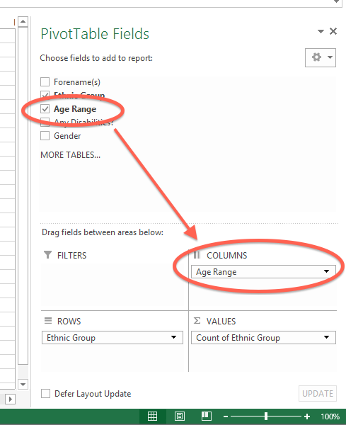
To do this, simply drag the "Age Range" heading from the "PivotTable Fields" area to the "COLUMNS" area.
The pivot table will update again; the new column (from the original table) is used as the column labels, and the totals are broken down into ethnic group/age range matches, as shown.
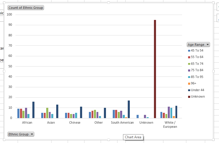
Creating a chart from this data
Creating a chart is done in the same way as before. Simply click in the data, then click the "PivotChart" button. For pivot tables where you are comparing data like this, something like a clustered column might be appropriate.
Filtering data in a Pivot Table
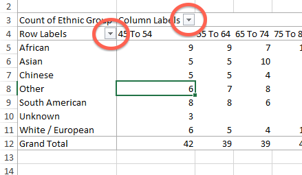
When data is added to the Pivot Table, the "Row Labels" and "Column Labels" headings appear with a drop-down box next to them, as shown.
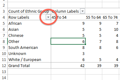
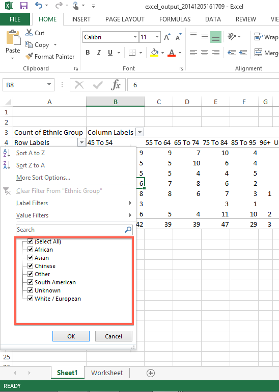
By clicking on these buttons, you can rearrange or filter the data. For example, if you want to display the data without any of the people that have "Unknown" entered as their ethnic group, click on the relevant button;
The "Manual Filters" section will appear. At the bottom, each of the labels is shown, with a tick box to indicate whether it will display or not.
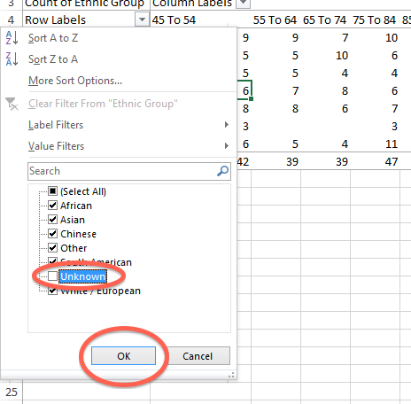
To hide the "unknown" entries, un-tick the "unknown" box, then click "OK".
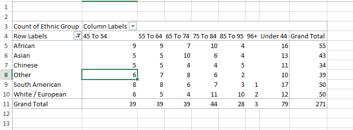
You will be returned to the pivot table, but the "Unknown" entries in the "Ethnic Group" rows are no longer shown. The subtotals and overall total will update accordingly.
Notes
This guide is intentionally brief. It only covers the basics, intended to get you up and running with pivot tables as quickly as possible. For further reading on Excel, there are plenty of free tutorials on the internet to help you learn more about it.
However, if you think there is anything in particular that should be added to this guide, do please let us know.
Rob Kay - manual author (talk) 16:41, 5 December 2014 (GMT)


