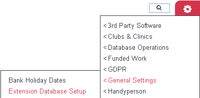
Extension Database Setup
Extension Databases provide a way for you to add fields, or sets of fields, to the system. They can be used to capture any information which is not catered for in the standard setup. See Extension Databases for an overview.
The Extension Database Setup page lists the Extension Databases that are already set up on your system (if there are any). You can amend existing Extension Databases and create new ones.
To create a new Extension Database click "New Extension Database" or click on the name of an existing Extension Database to edit it.
Extension Database Settings
On an existing Extension Database or when saving the Extension Database settings for a new one a navigation bar will appear at the top of the section:
This allows you to move between the following sections of the setup:
- Extension Database Settings - This is the general details of where the extension data base will appear and which security groups can access it.
- Extension Database Sections - Sections are used to group questions together to make data entry easier and more logical.
- Extension Database Fields - Fields are the bespoke questions and options that appear in the Extension Database.
You can now enter or edit:
- Name for additional data entry option - This is name of the Extension Database and will also be the button label that appears for the user.
- Description - This is information about the Extension Database which can only be viewed on this page,
- Linked to which main type of record?:
- Organisations and People - This will be able to be displayed on a record tab or at the footer of the record.
- Referrals - This allows the Extension Database to be displayed on the history tab, referral edit screen or appear when recording a contact. See Project Setup for further details.
- Clubs and Clinics - This will appear on the footer of a Club, Clinic or Group details page, for those specified.
- Tab - This option appears when the linked to option is set to 'Organisations and People'Specify weather the Extension Database is to be displayed on the record footer or which tab. Additional tabs can be setup, see Customise Orgs & People for details.
- Select specific type of record(s) -
- Organisations and People linked - Select the record type(s) that the Extension Database will be displayed on.
- Referrals linked - Select which project(s) the Extension Database will be used with. See Project Setup for further configuration options.
- Clubs and Clinics linked - Select which Club, Clinic or Group(s) that should display the Extension Database.
- Available to users in these groups - Select which Groups of users can access the Extension Database.
- One record or multiple records for this entry?
- One Record - This displays a single set of fields, if the data is changed the previous entry will be simply over written. This would be used for questions like 'Do you drive?', if circumstances changed you would simply change the answer to the question.
- One or More Records - This is used if multiple sets of data is required. As an example you could have an extension database to record donations given, as you may got more than one donation from the some person.
- Maximum number of column Headers to be viewable when selecting from multiple records? - When selecting 'One or More' you can specify the number of columns displayed for the Extension Database.
- Active? - When set to 'Yes' the Extension Database will be dis[played and can be reported on.
Once the above options have been completed you can then select one of the following save buttons:
- Save and edit Sections - Saves any changes and moves to the page to create sections, if required.
- Save and edit Fields - Saves any changes and moves to the page to create the fields to record the data.
- Save and Close - This is displayed on existing Extension Databases, saves the changes and returns to the list of existing Extension Databases.
Extension Database Sections
Sections allow you to break up fields into logical sections. Example:
Section 1: Assessment one
Date:
Range of questions

Section 2: Assessment two
Date:
Range of questions
To create a new section click on the lick 'Create a new Extension Database Section...'. Type the required label for the section and click go to create it.
The section will be created and added to the list of existing sections (if any).
To edit an existing section click on the sections name, click the Bin Icon to delete the section.
Reordering Sections
Click on the 'Enable Reorder' button to Enable reordering, from here you can drag and drop the sections to the required position, or use the A-Z or Z-A option. Once complete you can then click 'Disable Reorder'.
Extension Database Fileds
An Extension Data base can contain a series of different field types.
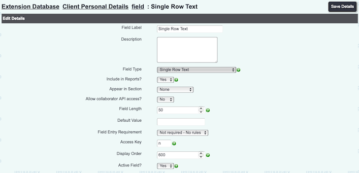
Single Row Alphanumeric String
This will display a single line text box based on the field length.
- Field Label - This is the name/question that is displayed to the user.
- Description - This is displayed as help text via a question mark icon
. This is note displayed when the fields are displayed on a tab.
- Appear in Section - If you are using sections you can specify which section this option appears in.
- Allow collaborator API access? - Used for API connections if your system links to a third party system. When set to yes you can then specify the API name to be used.
- Field Type - Option to select which of these field types you wish to use. Once a field has been created the field type cannot be changed. Set to 'Single Row Alphanumeric String'.
- Filter By Field - This option is displayed when at least one field has been created and is only used for 'Select from Option Dropdown List' and 'Radio Buttons' field types.
- Field length - This determines the length of the field and the maximum number of characters that can be entered.
- Default Value - You can populate the field with the details specified.
- Field Entry Requirement
- Not Required - No Rules - The field will be displayed but can be left blank.
- Warning - Warn if not filled in - The field will be displayed with a yellow background (not when set as radio buttons) and a pop up will be displayed if left blank when saving.
- Shortcut Key - Specify a shortcut key so the user can jump directly to this field when entering data. Please note that different operating systems and browser also use shortcut keys, this will override this option.
- Display Order - The order that this field will be displayed on the page or section.
- Active - When set to 'Yes' this field will be displayed to the user.
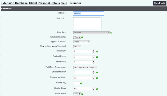
Numeric Only
Allows only numbers to be used and totals on displayed reports.
- Field Label - This is the name/question that is displayed to the user.
- Description - This is displayed as help text via a question mark icon
. This is note displayed when the fields are displayed on a tab.
- Appear in Section - If you are using sections you can specify which section this option appears in.
- Allow collaborator API access? - Used for API connections if your system links to a third party system. When set to yes you can then specify the API name to be used.
- Field Type - Option to select which of these field types you wish to use. Once a field has been created the field type cannot be changed. Set to 'Numeric Only'.
- Filter By Field - This option is displayed when at least one field has been created and is only used for 'Select from Option Dropdown List' and 'Radio Buttons' field types.
- Field length - This determines maximum number of digits (including decimal point), this works alongside the numeric maximum.
- Decimal Places - Specify the number of decimal places that are required, please keep in mind the field length.
- Default Value - Specify a default value that will be prepopulated.
- Field Entry Requirement
- Not Required - No Rules - The field will be displayed but can be left blank.
- Warning - Warn if not filled in - The field will be displayed with a yellow background (not when set as radio buttons) and a pop up will be displayed if left blank when saving.
- Shortcut Key - Specify a shortcut key so the user can jump directly to this field when entering data. Please note that different operating systems and browser also use shortcut keys, this will override this option.
- Display Order - The order that this field will be displayed on the page or section.
- Active - When set to 'Yes' this field will be displayed to the user.
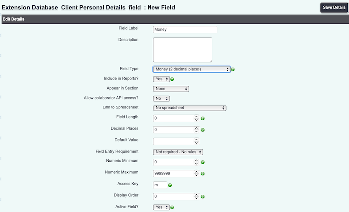
Money
Allows only numbers to be used and totals on displayed reports.
- Field Label - This is the name/question that is displayed to the user.
- Description - This is displayed as help text via a question mark icon
. This is note displayed when the fields are displayed on a tab.
- Appear in Section - If you are using sections you can specify which section this option appears in.
- Allow collaborator API access? - Used for API connections if your system links to a third party system. When set to yes you can then specify the API name to be used.
- Field Type - Option to select which of these field types you wish to use. Once a field has been created the field type cannot be changed. Set to 'Numeric Only'.
- Filter By Field - This option is displayed when at least one field has been created and is only used for 'Select from Option Dropdown List' and 'Radio Buttons' field types.
- Field length - This determines maximum number of digits (including decimal point), this works alongside the numeric maximum.
- Decimal Places - Specify the number of decimal places that are required, please keep in mind the field length.
- Default Value - Specify a default value that will be prepopulated.
- Field Entry Requirement
- Not Required - No Rules - The field will be displayed but can be left blank.
- Warning - Warn if not filled in - The field will be displayed with a yellow background (not when set as radio buttons) and a pop up will be displayed if left blank when saving.
- Shortcut Key - Specify a shortcut key so the user can jump directly to this field when entering data. Please note that different operating systems and browser also use shortcut keys, this will override this option.
- Display Order - The order that this field will be displayed on the page or section.
- Active - When set to 'Yes' this field will be displayed to the user.
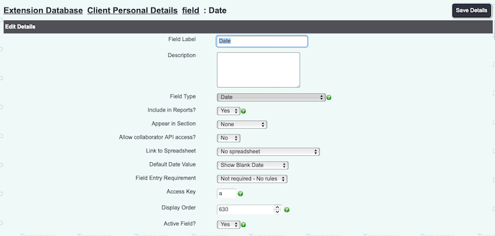
Date
Allows entry of a date, useful when reporting on certain periods.
- Field Label - This is the name/question that is displayed to the user.
- Description - This is displayed as help text via a question mark icon
. This is note displayed when the fields are displayed on a tab.
- Appear in Section - If you are using sections you can specify which section this option appears in.
- Allow collaborator API access? - Used for API connections if your system links to a third party system. When set to yes you can then specify the API name to be used.
- Field Type - Option to select which of these field types you wish to use. Once a field has been created the field type cannot be changed. Set to 'Date'.
- Filter By Field - This option is displayed when at least one field has been created and is only used for 'Select from Option Dropdown List' and 'Radio Buttons' field types.
- Default Value - You can populate the field with the date the record is entered or left empty.
- Field Entry Requirement
- Not Required - No Rules - The field will be displayed but can be left blank.
- Warning - Warn if not filled in - The field will be displayed with a yellow background (not when set as radio buttons) and a pop up will be displayed if left blank when saving.
- Shortcut Key - Specify a shortcut key so the user can jump directly to this field when entering data. Please note that different operating systems and browser also use shortcut keys, this will override this option.
- Display Order - The order that this field will be displayed on the page or section.
- Active - When set to 'Yes' this field will be displayed to the user.
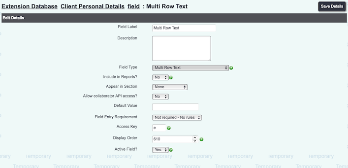
Multi Row Text Input
Displays a text box.
- Field Label - This is the name/question that is displayed to the user.
- Description - This is displayed as help text via a question mark icon
. This is note displayed when the fields are displayed on a tab.
- Appear in Section - If you are using sections you can specify which section this option appears in.
- Allow collaborator API access? - Used for API connections if your system links to a third party system. When set to yes you can then specify the API name to be used.
- Field Type - Option to select which of these field types you wish to use. Once a field has been created the field type cannot be changed. Set to 'Multi Row Text Input'.
- Filter By Field - This option is displayed when at least one field has been created and is only used for 'Select from Option Dropdown List' and 'Radio Buttons' field types.
- Field Entry Requirement
- Not Required - No Rules - The field will be displayed but can be left blank.
- Warning - Warn if not filled in - The field will be displayed with a yellow background (not when set as radio buttons) and a pop up will be displayed if left blank when saving.
- Shortcut Key - Specify a shortcut key so the user can jump directly to this field when entering data. Please note that different operating systems and browser also use shortcut keys, this will override this option.
- Display Order - The order that this field will be displayed on the page or section.
- Active - When set to 'Yes' this field will be displayed to the user.
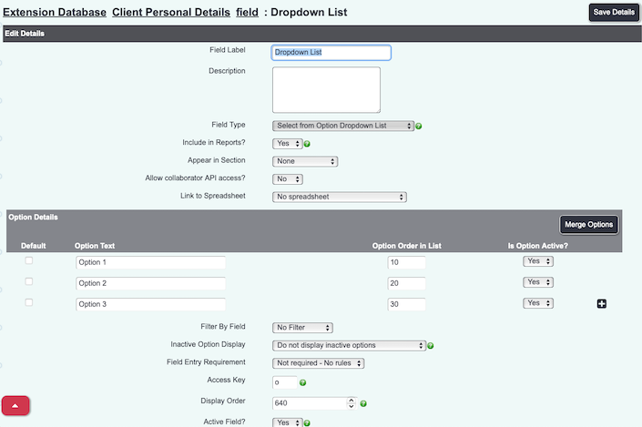
Select from Option Dropdown List
This will display a dropdown list that the user can select one option from.
- Field Label - This is the name/question that is displayed to the user.
- Description - This is displayed as help text via a question mark icon
. This is note displayed when the fields are displayed on a tab.
- Appear in Section - If you are using sections you can specify which section this option appears in.
- Allow collaborator API access? - Used for API connections if your system links to a third party system. When set to yes you can then specify the API name to be used.
- Field Type - Option to select which of these field types you wish to use. Once a field has been created the field type cannot be changed. Set to 'Multi Row Text Input'.
- Filter By Field - This allows the dropdown list to be filtered by another drop down list (does not work with radio buttons). The options that have been selected on a previous question can filter what options can be selected on this question. From the list select the dropdown list that is to be used to filter this question.
- Option Details - This is the items that will appear in the drop down list.
- Default - When ticked this option will automatically be selected when entering a new record.
- Option Text - This is the name displayed in the dropdown list.
- Display Order - The order the option will be displayed in the dropdown list.
- Selection list for the filter - Select which answers of the previously selected question that the current option is available to be selected. If you are using the filter and nothing is selected then the option cannot be selected. If the option is to be available to all then all answers to the previous question must be selected.
- Active - If set to yes then this option can be selected from the drop down list.
- Plus Icon
- Creates a new line for the next option.
- Inactive Option Display
- Do not display inactive options - Options that have been set as inactive will not be displayed in the dropdown list.
- Display inactive options as not selectable - This will display inactive options, which cannot be selected by the user.
- Field Entry Requirement
- Not Required - No Rules - The field will be displayed but can be left blank.
- Warning - Warn if not filled in - The field will be displayed with a yellow background (not when set as radio buttons) and a pop up will be displayed if left blank when saving.
- Shortcut Key - Specify a shortcut key so the user can jump directly to this field when entering data. Please note that different operating systems and browser also use shortcut keys, this will override this option.
- Display Order - The order that this field will be displayed on the page or section.
- Active - When set to 'Yes' this field will be displayed to the user.
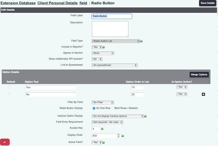
Radio Button List
As "Select from Option List", but options will be displayed as clickable buttons. Only one button can be selected at a time.
- You can choose whether the buttons display "On one row" (side by side), or "Multi Rows/Stacked" (one above the other).
Save Details
Click the "Save Details" button to save the field configuration.
Filter by Field
Option Dropdown List fields and Radio Button fields have an extra feature; they can be filtered by another field within the Extension Database. This is how it works.
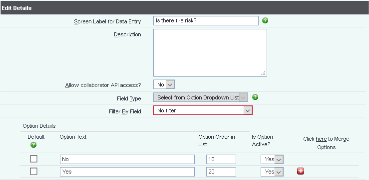
Suppose you set up a field in the Extension Database which is to ask if there is a fire risk, as shown:
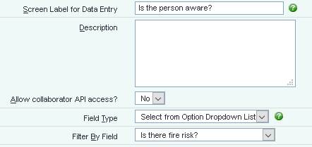
You can then set up another field, where the options that are shown depend on what the user picks in the previous field. For example, if you said there was a risk, you can then ask if the person was awre.
Name the field, and in "Filter By Field", select the field you want to filter by.
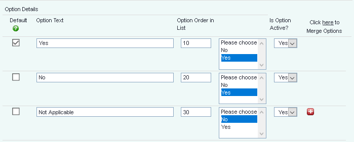
Now, for each option added to the list, you can select when that option will show, based on what's in the other field.
We can have a list of three options, two of which show if "Yes" has been selected and one of which shows if "No" has been selected.
The user will see both fields when filling in the information, but the second field will not show anything (apart from "Unknown") until the first field has been selected.
However, if the user selects "Yes", the second box will display the yes-related options:
...and if they select "no", the second box will display the no-related options.
It works the same way for Radio Button Lists. When nothing is selected in the first field, no options display in the second.
If the user selects "Yes", the second field displays the options for yes:
...and if they select "no", the second field will display the options for no.

