Extension Database Setup
Extension Databases provide a way for you to add fields, or sets of fields, to the system. They can be used to capture any information which is not catered for in the standard setup. See Extension Databases for an overview.
The Extension Database Setup page lists the Extension Databases that are already set up on your system (if there are any). You can amend existing Extension Databases and create new ones.
Setting up new Extension Databases
Click "New Extension Database".
Basic settings for the Extension Database
You can now enter:
- Name for additional data entry option - the name of the extension database
- Description - this will appear on the "Extension Database Reports" screen.
- Linked to which main type of record? - controls whether the extension database will be linked to someone's Details Screen, to Referrals, or to Clubs/Clinics.
- Select specific type of record(s) -
- in the case of extension databases on org/people records, this controls which type(s) of org/people the extension database displays for.
- in the case of extension databases on referral entries, this controls which Projects the extension database is available to.
- in the case of extension databases on clubs/clinics, this controls which club(s) the extension database displays for.
- Available to users in these groups - controls which user groups can see this extension database.
- One record or multiple records for this entry? - this controls whether the database can be filled in multiple times. Again, this option is not available for extension databases on the Client Personal tab.
- Active? - controls whether this extension database is currently in use or not. This is mainly used for switching off historical extension databases.
Remember that when selecting Projects/people types etc, you can select multiples from the list by holding "ctrl" (PC) or "Command" (Mac) and clicking the items in the list that you want.
Once these fields have been filled in, click "Save and Edit Fields".
Adding and editing fields
Click "New Field" to enter a new one.
Enter the following information;
- Screen Label for Data Entry - The Label is the name given to the field on screens and reports. This is what the user will see.
- Description - further description of the field if required. This will display as help text, shown when the user hovers over/clicks on the green help icon for this field, so it's best to always fill in a description, even if it's only brief.
- Field Type - Choose the relevant field type from the list. Note that this cannot be changed once data has been entered into the Extension Database as this could potentially corrupt existing data.
- Filter by Field - see the bottom of this page.
- Various other options will follow depending on which field type you have chosen - see below.
- Field Entry Requirement - choose whether the field is not required, forced (user will not be able to save the page without something in this field, this field will be red), or "warning" (user will be warned if they do not fill in the field, but will be allowed to save the page, this field will be yellow).
- Shortcut Key - This is an accessibility feature. The Shortcut is the character, shown as underlined in the field label, which is used as a keyboard shortcut to the entry of the field (Alt and a character on PC).
- Display Order - This will define the order in which fields appear on the screen when the data entry page is shown. It is worth leaving gaps to allow additional fields to be easily added later - numbering your fields as 10, 20, 30 etc.
- Active Field? - If you make the field non active, it will not be displayed on the data entry screen.
Field Types and associated options
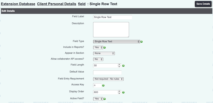
Single Row Alphanumeric String
A simple field where the user can enter any text or numbers. When this type is selected, you can choose;
- Field Length in number of characters (including spaces)
- Default Value to be shown in the field when the user first sees it. Leave this field blank if there is no default value.
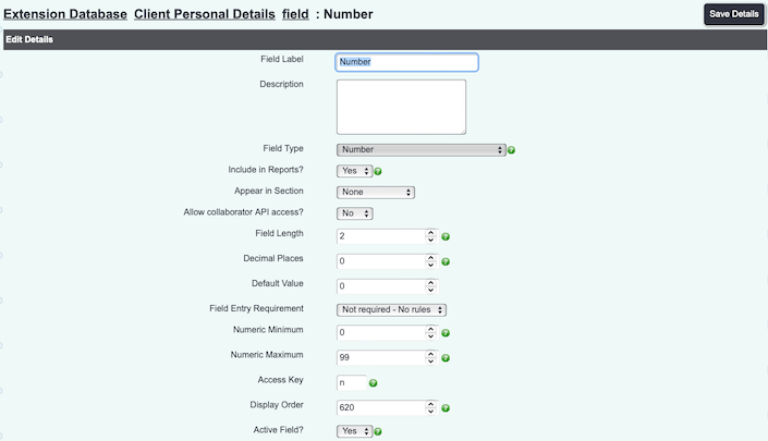
Numeric Only
A field where the user must enter a number (no text allowed). When this type is selected, you can choose;
- Field Length in characters including the decimal point if there is to be one
- Decimal Places
- Default Value to be shown in the field when the user first sees it. Leave this field blank if there is no default value.
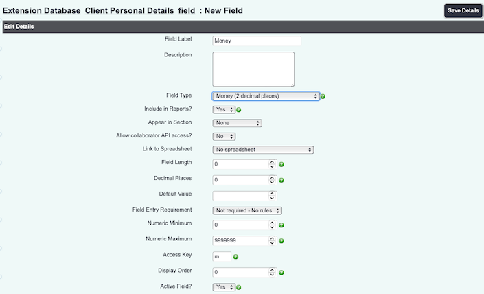
Money
As "Numeric Only", but formatted for currency.
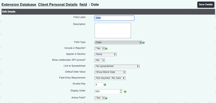
Date
A date field, with the standard date formatting/date picker applied. You can choose;
- Default Value - choose from "Show blank date" or "Default to current date".
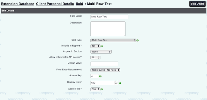
Multi Row Text Input
As "Single Row Alphanumeric String" but with no limitation on the field length.
- If required, choose a Default Value' to be shown in the field when the user first sees it. Leave this field blank if there is no default value.
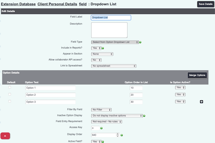
Select from Option Dropdown List
Lists set up here will display as a single dropdown list for the user to pick an option from. Add as many options as you need with the red "+" button and name them appropriately. They will automatically be created with display order of 10, 20, 30 etc.
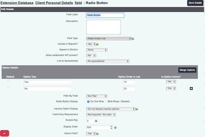
Radio Button List
As "Select from Option List", but options will be displayed as clickable buttons. Only one button can be selected at a time.
- You can choose whether the buttons display "On one row" (side by side), or "Multi Rows/Stacked" (one above the other).
Save Details
Click the "Save Details" button to save the field configuration.
Filter by Field
Option Dropdown List fields and Radio Button fields have an extra feature; they can be filtered by another field within the extension database. This is how it works.
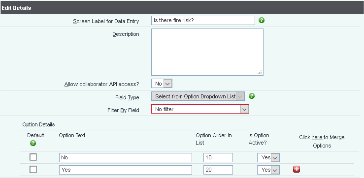
Suppose you set up a field in the extension database which is to ask if there is a fire risk, as shown:
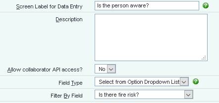
You can then set up another field, where the options that are shown depend on what the user picks in the previous field. For example, if you said there was a risk, you can then ask if the person was awre.
Name the field, and in "Filter By Field", select the field you want to filter by.
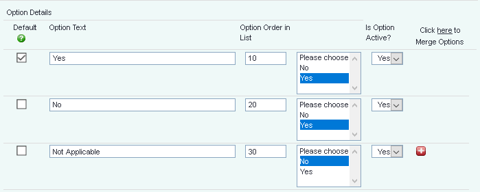
Now, for each option added to the list, you can select when that option will show, based on what's in the other field.
We can have a list of three options, two of which show if "Yes" has been selected and one of which shows if "No" has been selected.
The user will see both fields when filling in the information, but the second field will not show anything (apart from "Unknown") until the first field has been selected.
However, if the user selects "Yes", the second box will display the yes-related options:
...and if they select "dogs", the second box will display the dog-related options.
It works the same way for Radio Button Lists. When nothing is selected in the first field, no options display in the second.
If the user selects "cats", the second field displays the cat names:
...and if they select "dogs", the second field will display the dog names.

