Analytics
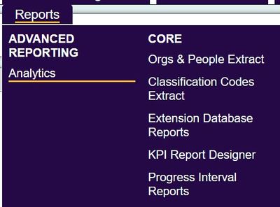
Analytics is a tool that allows you to analyse and compare figures. It will not produce raw data in the way that the KPI reports does, but instead provides an inbuilt function to create graphs and tables. The Analytics Report also drives the dashboard panels. The following webinar will explain its functions.
Report Types
At present you can report on the following:
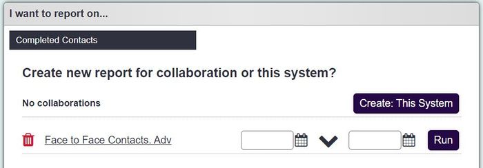
- Completed Contacts: - This reports on contacts entered whist Recording Contacts (similar to number of contacts).
- Outstanding Contacts: This reports on outstanding actions only created when Recording Contacts.
- Referrals: This reports on referrals that have been entered on the system.
- Schedules: This reports on Roster Jobs (not the Plans)
- Service Receiver: This reports on People/Organisations entered on the system, irrespective of any project work or referrals (similar to a data extraction).
Report Setup
Date Range: This is available for all of the above options except service receiver, which simply looks at all clients on the system.
Dimensions and Metrics:
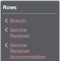
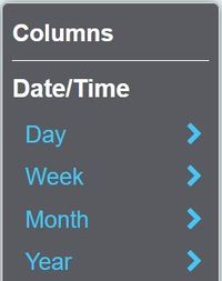
You can choose what you want to appear on the columns and rows of your table or chart. Most things are available to both, however you can only use date/time options on the columns and User on the rows.
Filters:
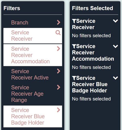
The filter option adds a great advantage, as it cuts out the requirement for handling the raw data in excel. You can apply as many filters as you want, in a similar way to the filters on Data extraction/mail merge.
Save report
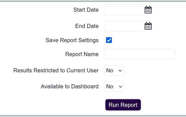
If you want to save the report you've created to re-run in the future, you can tick a box before proceeding that will let you name and save the report.
When saving you can specify:
- Report Name - The name displayed on the 'Saved Reports' section.
- Available to Dashboard - If this report is available to add to the system Dashboard.
- Results Restricted to Current User - Specifies that this save report will only be displayed to yourself.
When clicking the 'Run Report' button the report will be saved.
Results
You can display the results in a few different formats. There are:
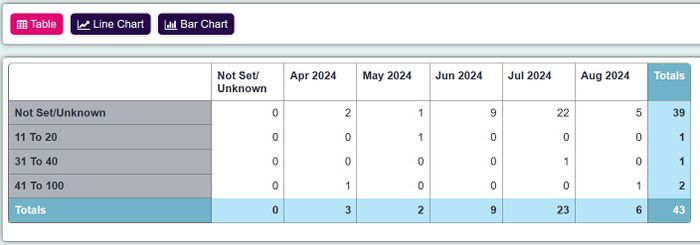
Table
You can display this on the screen or export it to a csv, by choosing the last button.
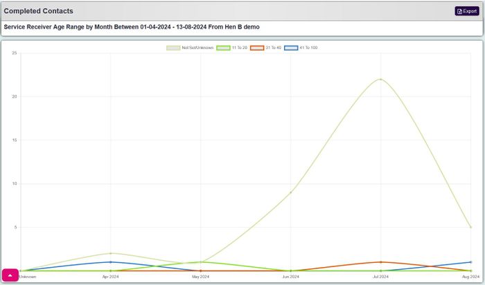
Line graph
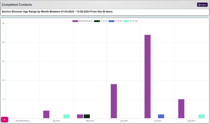
This displays the results in a curving line graph. You can choose to exclude certain Metrics in all of the graphs, such as if you want to ignore all contacts that were of an unknown type like the example below. The graph will immediately alter itself once you select or de-select the metrics from along the top of the graph.
Bar Chart
This works much in the same way as the line graph, but with bars.
Pie Chart
This option is only available when you have chosen one axis.
