Difference between revisions of "Reports (Administrator guide)"
| Line 101: | Line 101: | ||
Length of spreadsheet output is one of the primary reasons that Charitylog has moved to the .xlsx (Office 2010) output format. The old .xls format only allowed 256 columns, whereas .xlsx allows somewhere over 16,000 (not that you would want or need that many for a Charitylog output). | Length of spreadsheet output is one of the primary reasons that Charitylog has moved to the .xlsx (Office 2010) output format. The old .xls format only allowed 256 columns, whereas .xlsx allows somewhere over 16,000 (not that you would want or need that many for a Charitylog output). | ||
| + | |||
| + | ===Map View=== | ||
| + | |||
| + | The Blue Folder Lookup screen also allows an output to be displayed on a map. This has various uses, but all of the most obvious are to do with geographical location - for example; | ||
| + | |||
| + | * Display all new clients over the last three years, and see where your client base is | ||
| + | * Display all new clients over the last year, and see how new projects have affected your clients' uptake of your services | ||
| + | * Display clients accessing a particular service/Project - are there holes in the coverage that cannot be explained? Do you need to make more efforts at outreach in those communities? | ||
| + | * Check for incorrectly filled Super Output Areas - are there any outliers displayed that might be wrong? | ||
| + | |||
| + | The map view relies on postcodes to place the clients/people, so if there is no postcode entered on their record, the map view will discard them. This is one of the reasons we advise that a name and a postcode should always be a minimum for data capture. | ||
===Getting the data in in the first place=== | ===Getting the data in in the first place=== | ||
Revision as of 13:12, 18 May 2013
About Charitylog's reporting features
For most organisations, the ability to produce reports from Charitylog is probably the most important aspect of the whole system. Charitylog provides many ways to get the data that users enter on the system back out again. The most obvious ones are the preset reports, which are designed for a specific purpose and cannot be customised by the user. These are scattered through the system - for example, reports for the Support Worker module are usually accessible from the same submenu as the rest of the module's functionality. Some of these simple reports are also in the "Reports" submenu, such as the Office Reports, and these are dealt with in the end user manual: Reports.
The rest of these reports are dealt with together with the activity they relate to, so details of the Support Worker reports are in the Administrator guide to the Support Worker module, and so on. This chapter deals with the customisable reports, which are where the real power of Charitylog's reporting lies. This chapter looks mainly at three features: Blue Folder Lookups, KPI Reports and Data Extraction.
Contents
- 1 About Charitylog's reporting features
- 2 Blue Folder Lookups
- 3 The KPI Report Designer
- 4 Action List
- 5 Benefits Report
- 6 Data Extraction/Mail Merge
- 7 Extension Database Reports
- 8 IMCA Reports
- 9 KPI Report Designer
- 10 Office reports
- 11 Print Job Cards
- 12 Referral Reports
- 13 Timesheets
- 14 Outcome Reports
- 15 Support Worker Reports
- 16 Club & Clinic Reports
- 17 Handyperson Reports
- 18 Volunteering Reports
- 19 Progress Interval Reports
Blue Folder Lookups
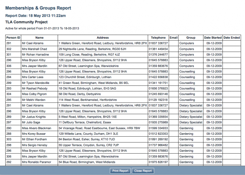
If you have tried out some of the simple reports, you may have seen blue folders displayed on some of the outputs. For example, running the "Memberships/Skills Report" shows all of the Organisations/People on your system who belong to/have a group or skill. The basic output of the report looks something like this:
This output is fine, as long as it contains the information you need, but suppose that you want to cross-reference this output with some other information. The "real world" thought process might go like this -
We ask all of our clients whether they consider themselves computer literate, and we use a skill group called "computers" to log this, putting them in the group if they are computer literate. We also log the disabilities our clients have, if they have any. I wonder what the data would show if I could cross-reference this with the "Computers" group? Does the fact that someone has a disability affect whether they see themselves as computer literate? If it does, does the disability in question matter? A lot of our clients have arthritis - is having arthritis likely to affect your confidence with a computer? Is there anything we can do about this?... and so on.
To answer these questions you could do the following -
- Run the "Memberships/Skills Report" to see who is in the "Computers" group.
- Export this to a spreadsheet.
- Look up the relevant clients and their disabilities.
- Add these to the spreadsheet.
Steps 1 and 2 are easy; steps 3 and 4 will take a long time. What you need is an easy way to say to the system, "show me the ouput of this report, and add on the disability data for the relevant clients" - and this is exactly what Blue Folder Lookups allow you to do.
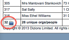
At the bottom of the reporting output is a blue folder.
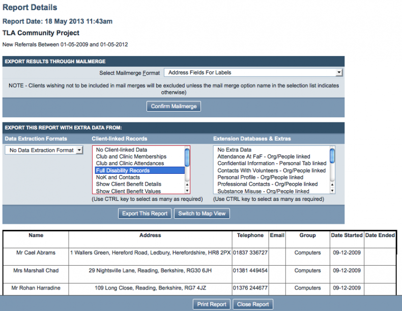
Clicking this blue folder will take you to the lookup page.
At the bottom of the page, the data is displayed. At the top, however, we have two extra sections: Export Results Through Mailmerge, and '"Export This Report With Extra Data From.
Export Results Through Mailmerge
This section will allow you to put together the output of your report with a mail merge, which you have previously set up. Mail merges will be covered later in this chapter.
Export This Report With Extra Data From
This section has two ways to output data: as a spreadsheet, using the "Export This Report" button, or on a map, using the "Switch to Map View" button.
Exporting a spreadsheet
The basic spreadsheet to be exported will be roughly the same as the original report output. However, by using this section, you can add columns onto the spreadsheet with more data in about the relevant clients.
Extra data from a Data Extraction
See later in this guide for details of setting up Data Extractions.
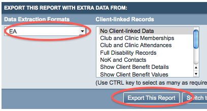
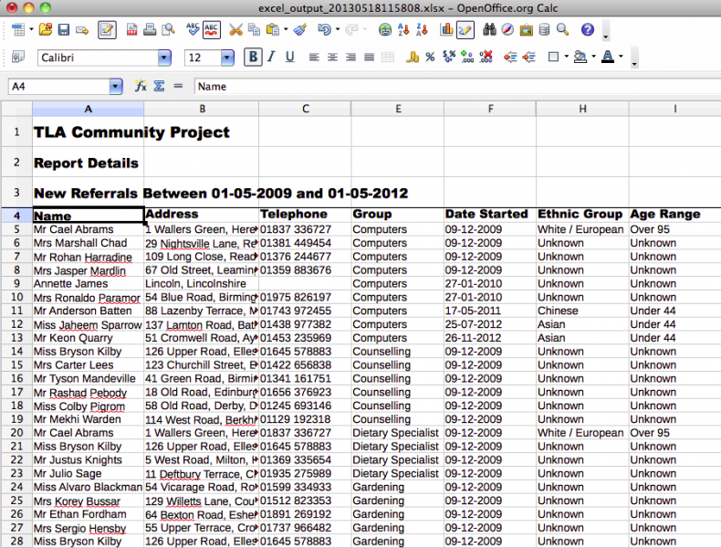
Once you have a data extraction set up, you can use that data extraction on any reporting output, using this drop-down box. For example, a data extraction has been set up named "EA", which shows the age range and ethnic background of any pool of clients. If you select this data extraction, and click the "Export This Report" button;
The resulting spreadsheet looks like this:
Not particularly tidy, but very informative. What you have here, after only a few clicks, is a spreadsheet showing:
- All people that were active in a skill group over a certain date range
- The information about the age ranges of those particular people
- The information about the ethnic backgrounds of those particular people
You can use this spreadsheet to show:
- Whether the people in a particular group are biased towards a particular ethnic background and/or age range
This could actually be a very useful thing to know. For example, if the members of the group "Computers" (meaning the person considers themselves to be computer literate) contains nobody with a disability, does that mean that people with disabilities in your funded area are not being supported to access computers?Can your organisation do anything to help, or signpost people to an organisation which can help?
If the members of the group "Befrienders" are all younger and male, will this have an impact on how many people take up your Befriending service? Is there a need for more female Befrienders, and/or more older Befrienders?
...and so on. If you are using a paper filing system, and/or each department has its own database, you would not be able to answer these questions without a huge amount of manual data collection, counting and tabulating. Using Charitylog means that you can do this easily, in less than a minute.
Extra data from Client-linked Records
You also have the option to add data from Client-linked records. Various options are available. Like data extractions, these will simply add more columns on to the output spreadsheet. You can select more than one set of client-linked records by shift-clicking a range (PC or Mac), or holding the "Ctrl" button (PC) or the "Command" button (Mac) and clicking the options you require.
Extra data from Extension Databases & Extras
Finally, you can add extra data from the Extension Databases you have on your system (providing they are Organisation/Person linked or Personal Tab-linked).
Spreadsheet output size
You can add as many options as you need - there is nothing to stop you using a data extract which gives 20 fields on every result, then adding all the Client-linked records, and all the Extension Database records. However, this will result in an extremely long spreadsheet which is difficult to work with. Consider breaking your requirements down into a series of spreadsheets and then work with these.
Length of spreadsheet output is one of the primary reasons that Charitylog has moved to the .xlsx (Office 2010) output format. The old .xls format only allowed 256 columns, whereas .xlsx allows somewhere over 16,000 (not that you would want or need that many for a Charitylog output).
Map View
The Blue Folder Lookup screen also allows an output to be displayed on a map. This has various uses, but all of the most obvious are to do with geographical location - for example;
- Display all new clients over the last three years, and see where your client base is
- Display all new clients over the last year, and see how new projects have affected your clients' uptake of your services
- Display clients accessing a particular service/Project - are there holes in the coverage that cannot be explained? Do you need to make more efforts at outreach in those communities?
- Check for incorrectly filled Super Output Areas - are there any outliers displayed that might be wrong?
The map view relies on postcodes to place the clients/people, so if there is no postcode entered on their record, the map view will discard them. This is one of the reasons we advise that a name and a postcode should always be a minimum for data capture.
Getting the data in in the first place
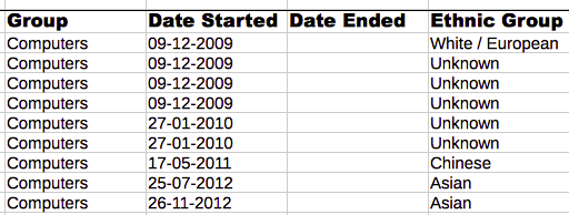
Look again at the spreadsheet output for the data extraction "EA", which added age range and ethnic group information onto the output of the Memberships/Skills Groups report.
This demonstrates the power available in Charitylog, of being able to get out any data you have on the system, cross-referenced with other data. However, this spreadsheet also shows the most common problem with extracting this data - the fact that users fail to enter it in the first place. The column for Ethnic Group shows that while a few people in this group have their Ethnic Group recorded on Charitylog, the majority do not.
This is not a problem for the day-to-day running of the service; you might well imagine that a volunteer manager would not want to explicitly ask every volunteer for their age and which ethnic group they consider themselves to be in - if done wrongly, it could look confrontational and unnecessary. However, from the point of view of the chief executive, or the fundraiser, it becomes very important.
- If your Computer Literacy project is only succeeding in serving people under 40, even though you know from market research that there is a real need for computer tuition for people over 60, is this to do with the people that are delivering the service? Are they all under 25? Does this have a bearing on the clients that are willing to take the service up, bearing in mind that the volunteer tutors have to enter the client's home? Are people who live alone particularly unlikely to take up this service?...
If the age range information has not been input by users in the first place, there is no way to answer, or even ask, these questions.
This is why it's so important that an organisation's data capture (and therefore data protection) policy is well thought out, and communicated to staff. Implementing Charitylog often provides a chance for an organisation to do this for the first time - speak to your Implementation Consultant if you have any questions.
The KPI Report Designer
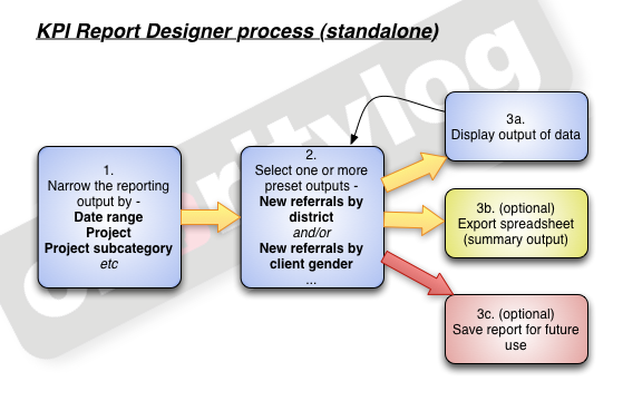
The KPI (Key Performance Indicator) Report Designer allows you to see "certain things by another thing" - for example, "number of new referrals by district". This really means you are asking the system, "show me all of the new referrals, along with the district of the relevant clients, and group the results together by district". The KPI Report Designer takes a 3-step approach, as shown.
Step 1: narrow the reporting output
Open the "Reports" submenu, then click on the "KPI Report Designer" menu item.
This will take you to the first step of the KPI Report Designer.
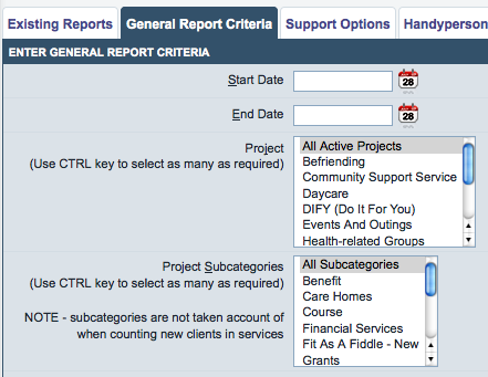
General Report Criteria
When creating a report you need to be able to narrow it by some fundamentals, otherwise all of the reports produced would be huge (if every report looked at all of your data). Throughout the Charitylog system you are able to narrow your selections by two fundamental qualities: a date range, and a Project. The same applies here - the "General Report Criteria" tab lets you choose a date range and the Project(s) you want to look at. You can also narrow the report further by Project Subcategory.
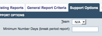
Support Options
There are also some options specific to the Support Worker module, and these are shown on the Support Options tab.
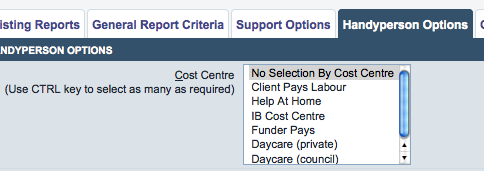
Handyperson Options
Handyperson module-specific items are shown on this tab.
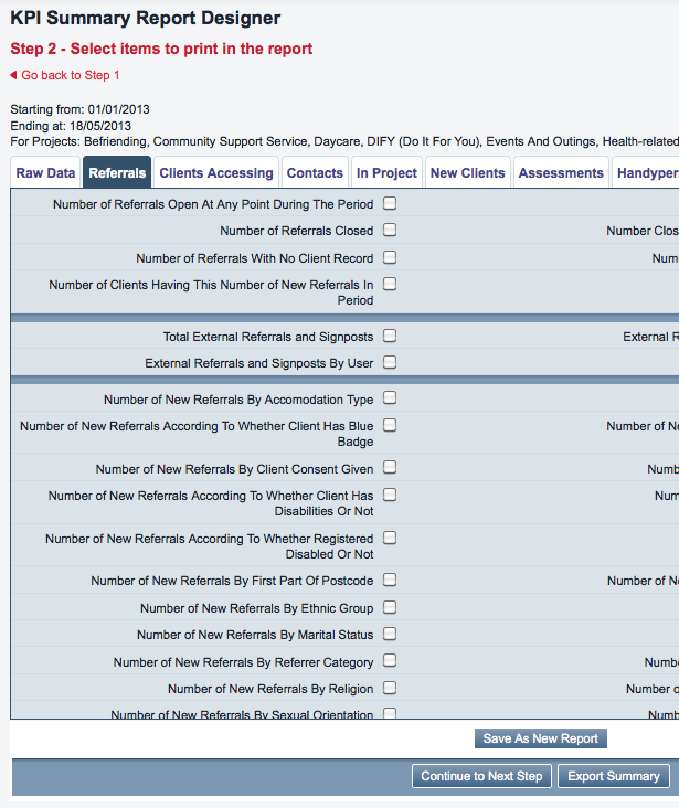
Step 2: select items to print
The screen you will now see has a series of tabs, with many tick boxes displayed for each tab. (section of page shown)
The tabs group the output options, and each output option (usually) is one "thing by thing" - "new referrals by district" being an example. The tabs are as follows.
Raw Data tab
General data extractions - so these are not something by something else - rather, they will be a full data spreadsheet, which you can do with as you wish.
Referrals tab
These are to do with the Referrals on your system - the available items are mainly focused on new referrals, but there are also items for closed referrals and external referrals.
Clients Accessing tab
These items focus on the clients themselves, so even if a client has several referrals ongoing, they will only be counted once.
Contacts tab
These items focus on contacts with clients, so one client who has been into your office for four visits would be counted four times, etc.
In Project tab
Clients In Project items and Termination-specific items. For more information on the concept of "Clients In Project", see the Projects chapter.
New Client tab
Items relating to clients that were new to the selected Projects in the time period.
Assessments tab
Items relating to Assessments.
Handyperson tab
Items relating to the Handyperson module.
Clubs & Clinics tab
Items relating to Clubs and Clinics.
Support tab
Items relating to the Support Worker module.

